

Why is veterinary website design so important?
You know your clinic needs to support a website, but WHY? Understanding the purpose of a veterinary website is important to creating one that converts new clients.
Your website must accommodate the needs of the user. Having a simple clear intention on all pages will help the user interact with what you have to offer.
- Developing community awareness through showcasing your culture, mission and unique value proposition.
- Building your reputation; by showcasing your expertise, employees and services
- Generating leads to bring new business
- Educating your clients and prospects
Pet parents must see clearly what functions are available on your website in a quick and simple format. The content must be well understood. Our goal is to make the experience simple for users when navigating your website, REMOVING question marks. Website visitors must feel comfortable when collaborating with your website.
In the following sections we will discuss how this can be achieved.
1. Website Colour
Colour has the power to communicate messages and evoke emotional responses. Finding a colour palette that fits your brand will allow you to influence your customer’s behaviour towards your brand. Keep the colour selection limited to less than 5 colours. Complementary colours work very well. Pleasing colour combinations increase customer engagement and make the user feel good.
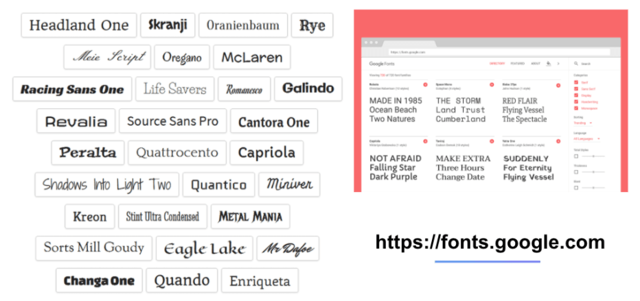
2. Website Fonts
Typography has an important role to play on your website. It commands attention and works as the visual interpretation of the brands voice. Typefaces should be legible and only use a maximum of 3 different fonts on the website. I'll say that again, DO NOT use more than 3 different styles of font on your website. Make sure to choose a font that is easy to read and doesn’t clutter the website.
3. Visual Hierarchy
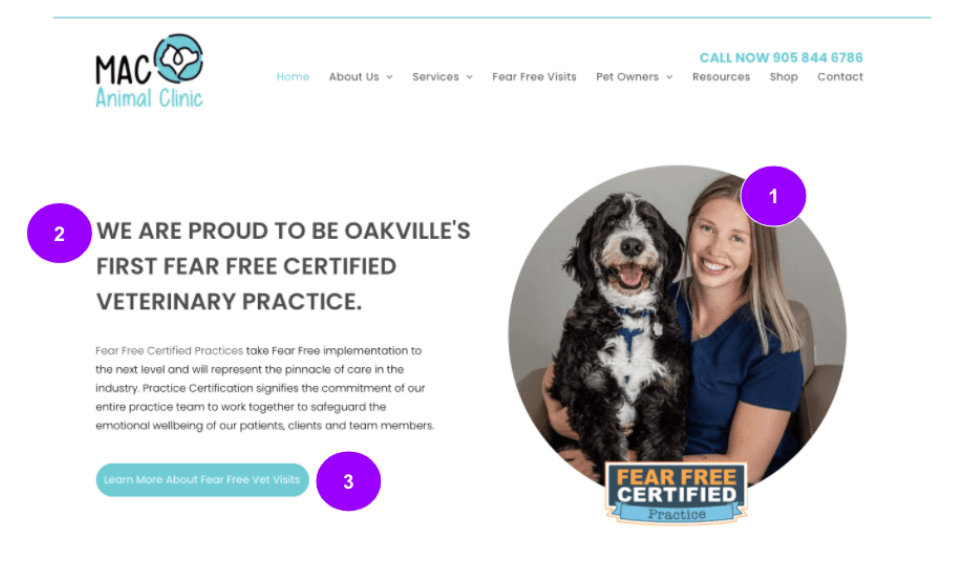
Let's quickly touch on visual hierarchy. Visual hierarchy is the arrangement of elements in order of importance. This is achieved by size, colour, imagery, contrast, font whitespace, texture or styles. A focal point must be established. Let's look at the example on the screen. You will see that there is a lot of information on this web page. Including navigation, logo, image, paragraph. But what jumps off the screen is the contrast button, under the paragraph. The reason this jumps of the screen is the whitespace that has been allowed around the button.
4. Veterinary Website Content
We will start by discussing the website navigation bar. See the image below for a sample of a successful website navigation.
- Limit the number of menu items to seven or 8 maximum
- Items at the beginning and at the end are most important
- Phone number must “click to call” on a mobile version of the website
- Logo must click back to the home page
- There must be an about us, services and contact navigation item
- Don’t forget the phone number! I repeat…
5. Repurpose Content
By “repurposing” content – that is, using the same information in multiple formats – you can boost your website’s search engine rankings while also saving yourself time.
Here’s how that might work...
Start by recording a video explaining how to trim your dog's nails safely and stress-free.
- Upload the video to YouTube
- Use YouTube link and paste it into automated speech transcription, now you have a blog post for the website!
- Take snippets from the blog and post them to social media.
- Share the video on social media and on your website
do you want to grow your business?
Hey, I'm Grant Gooley. I'm determined to make a brand grow. My only question is, will it be yours?